DxSolo UI Component Library
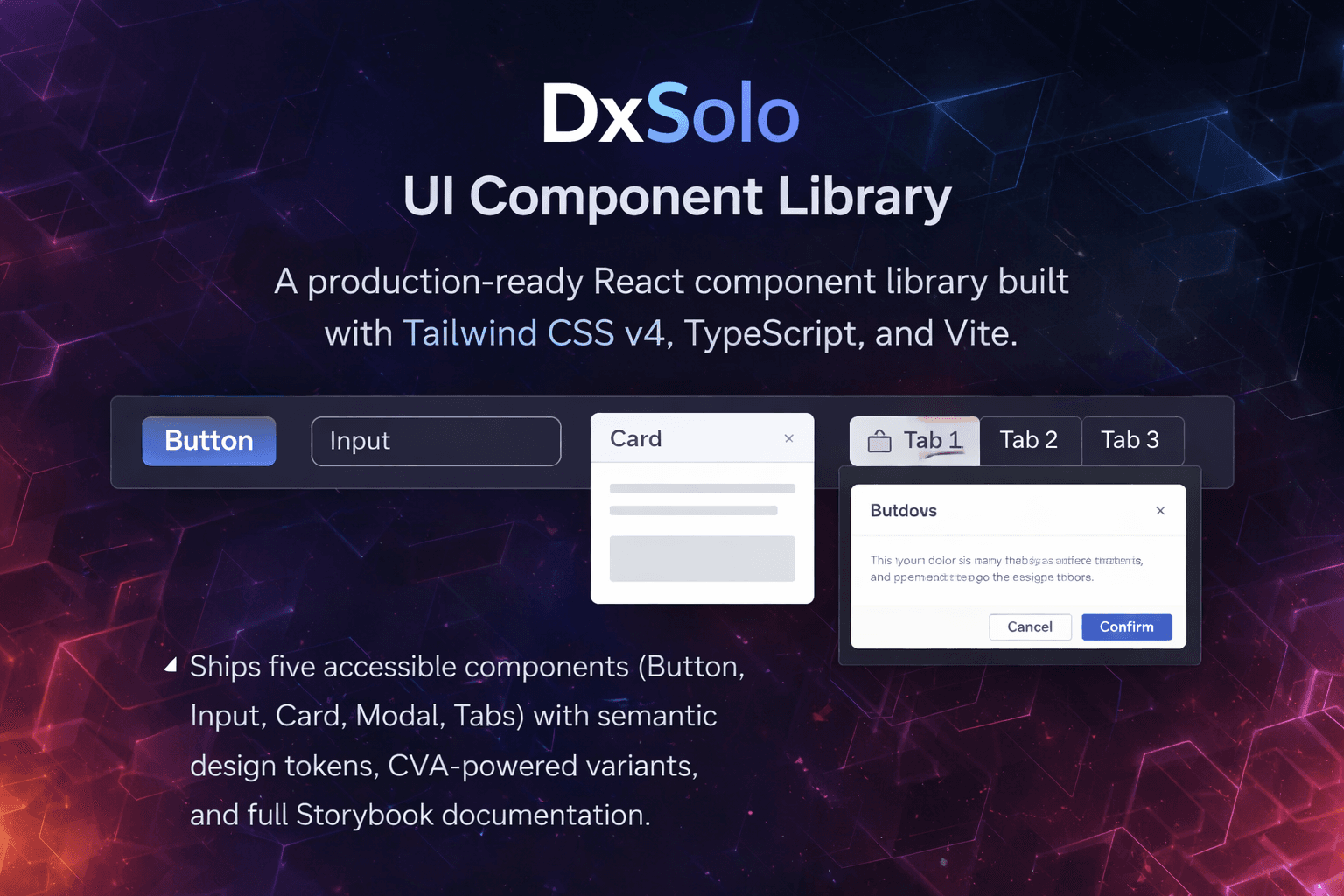
A production-ready React component library built with Tailwind CSS v4, TypeScript, and Vite. Ships five accessible components (Button, Input, Card, Modal, Tabs) with semantic design tokens, CVA-powered variants, and full Storybook documentation.