Build a Code Editor Like VS Code, Part 7: A Real File Tree and Four More Features
AdminJune 26, 202613 min read
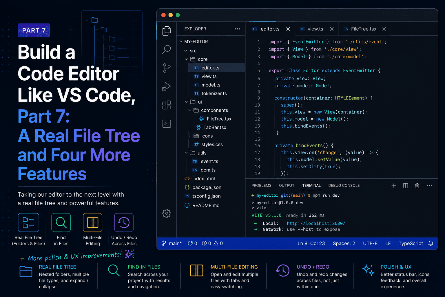
Part 6 was the end of the core build. This part is optional, and it changes register: instead of building the next necessary piece, we level up the pieces we have to look more like the real thing. We swap our hand-rolled file tree for a production-grade one, give it real file-type icons, add four signature VS Code features, and finish with a map of everything still left to build.
Our hand-rolled tree from Part 3 taught the concept, but it has real limits. It renders
every visible row even in a huge folder, it has no keyboard navigation, and it can't
rename or move files. react-arborist solves all of that. It virtualizes rows so a
folder with ten thousand files stays smooth, it handles arrow-key navigation and
type-to-select for free, and it gives us inline rename and drag-to-move with a callback
each.
npm install react-arboristArborist wants the data as a tree of nodes, each with a stable id and optional children.
That's a different shape from our Part 3 readDir, which returned one flat level at a
time. So we add a main-process handler that walks the directory recursively, skipping
the heavy folders you never want to render.
First the shared type, in src/shared/types.ts:
export interface TreeNode {
  id: string // absolute path, used as the stable id
  name: string
  children?: TreeNode[] // present on directories, absent on files
}
Then the handlers in the main process, alongside the ones from Part 3. We add a recursive read, a rename, and a move:
import { readdir, rename } from 'fs/promises'
import { join, dirname, basename } from 'path'
import type { TreeNode } from '../shared/types'

const IGNORE = new Set(['node_modules', '.git', '.DS_Store'])

async function readTree(dir: string): Promise<TreeNode[]> {
  const entries = await readdir(dir, { withFileTypes: true })
  const nodes = await Promise.all(
    entries
      .filter((e) => !IGNORE.has(e.name))
      .map(async (e) => {
        const full = join(dir, e.name)
        return e.isDirectory()
          ? { id: full, name: e.name, children: await readTree(full) }
          : { id: full, name: e.name }
      })
  )
  return nodes.sort((a, b) => {
    const aDir = Boolean(a.children)
    const bDir = Boolean(b.children)
    if (aDir !== bDir) return aDir ? -1 : 1
    return a.name.localeCompare(b.name)
  })
}

function registerTreeHandlers(): void {
  ipcMain.handle('fs:readTree', (_e, dir: string) => readTree(dir))

  ipcMain.handle('fs:rename', async (_e, path: string, name: string) => {
    const target = join(dirname(path), name)
    await rename(path, target)
    return target
  })

  ipcMain.handle('fs:move', async (_e, src: string, destDir: string) => {
    const target = join(destDir, basename(src))
    await rename(src, target)
    return target
  })
}
Call registerTreeHandlers() in the whenReady block. The trade we're making: this
walks the whole tree up front instead of lazily per folder. Arborist virtualizes the
rendering, so a big tree is cheap to display, but the initial walk does cost more than
Part 3's lazy load. Skipping node_modules and .git keeps it sane for real projects.
Lazy-loading into arborist is possible by patching its data on expand, and it's a good
exercise once the rest works.
Expose the three handlers through preload, next to the Part 3 functions:
readTree: (dir: string): Promise<TreeNode[]> => ipcRenderer.invoke('fs:readTree', dir),
rename: (path: string, name: string): Promise<string> =>
  ipcRenderer.invoke('fs:rename', path, name),
move: (src: string, destDir: string): Promise<string> =>
  ipcRenderer.invoke('fs:move', src, destDir),
And add their signatures to the window.api type in src/preload/index.d.ts.
For Quick Open later in this part, App needs to know the open folder and its files,
not just the explorer. So we move the folder state up: App owns rootDir and the
loaded tree, opens the folder, and passes the data and handlers down to a now
presentational FileExplorer. This is the same lift we did for the open file in Part 3,
applied to the workspace.
src/renderer/src/explorer/FileExplorer.tsx:
import { useEffect, useRef, useState } from 'react'
import { Tree, type NodeRendererProps } from 'react-arborist'
import type { TreeNode } from '../../../shared/types'

interface Props {
  tree: TreeNode[] | null
  onOpenFolder: () => void
  onOpenFile: (path: string) => void
  onRename: (path: string, name: string) => void
  onMove: (src: string, destDir: string) => void
}

export default function FileExplorer({
  tree,
  onOpenFolder,
  onOpenFile,
  onRename,
  onMove
}: Props) {
  const ref = useRef<HTMLDivElement>(null)
  const [size, setSize] = useState({ width: 0, height: 0 })

  // Arborist needs an explicit pixel size, so we measure the container. The
  // container only renders once we have a tree, so we re-run when `tree`
  // appears: on the first mount it doesn't exist yet, and an effect with an
  // empty dependency list would never attach the observer to it.
  useEffect(() => {
    const el = ref.current
    if (!el) return
    const ro = new ResizeObserver(() =>
      setSize({ width: el.clientWidth, height: el.clientHeight })
    )
    ro.observe(el)
    return () => ro.disconnect()
  }, [tree])

  if (!tree) {
    return (
      <div className="explorer-empty">
        <button className="open-btn" onClick={onOpenFolder}>
          Open Folder
        </button>
      </div>
    )
  }

  return (
    <div ref={ref} className="tree-container">
      <Tree
        data={tree}
        idAccessor="id"
        childrenAccessor="children"
        openByDefault={false}
        width={size.width}
        height={size.height}
        indent={12}
        rowHeight={24}
        onActivate={(node) => node.isLeaf && onOpenFile(node.id)}
        onRename={({ id, name }) => onRename(id, name)}
        onMove={({ dragIds, parentId }) =>
          dragIds.forEach((id) => onMove(id, parentId ?? ''))
        }
      >
        {Node}
      </Tree>
    </div>
  )
}

function Node({ node, style, dragHandle }: NodeRendererProps<TreeNode>) {
  return (
    <div
      className="tree-row"
      style={style}
      ref={dragHandle}
      onClick={() => !node.isLeaf && node.toggle()}
    >
      <span className="tree-icon">
        {node.isLeaf ? '·' : node.isOpen ? '▾' : '▸'}
      </span>
      {node.isEditing ? (
        <input
          className="tree-input"
          autoFocus
          defaultValue={node.data.name}
          onBlur={() => node.reset()}
          onKeyDown={(e) => {
            if (e.key === 'Escape') node.reset()
            if (e.key === 'Enter') node.submit(e.currentTarget.value)
          }}
        />
      ) : (
        <span className="tree-label">{node.data.name}</span>
      )}
    </div>
  )
}
A few arborist specifics worth naming. onActivate fires when a row is opened with a
click or Enter, which is where we open files. The Node render function gets a node
object with the state and methods we need: isLeaf, isOpen, isEditing, plus
toggle(), submit(value), and reset(). Inline rename is built in: pressing Enter on
a selected node sets node.isEditing, and our input calls node.submit to commit, which
fires onRename. The dragHandle ref is what makes a row draggable, and dropping fires
onMove. To start a rename from the keyboard, arborist uses Enter by default; you can
also call node.edit() from a context menu later.
In App, own the workspace and wire the persistence handlers to refresh the tree after
a change:
const [rootDir, setRootDir] = useState<string | null>(null)
const [tree, setTree] = useState<TreeNode[] | null>(null)

async function openFolder(): Promise<void> {
  const dir = await window.api.openFolder()
  if (!dir) return
  setRootDir(dir)
  setTree(await window.api.readTree(dir))
}

async function refreshTree(): Promise<void> {
  if (rootDir) setTree(await window.api.readTree(rootDir))
}

async function renamePath(path: string, name: string): Promise<void> {
  await window.api.rename(path, name)
  await refreshTree()
}

async function movePath(src: string, destDir: string): Promise<void> {
  await window.api.move(src, destDir || rootDir!)
  await refreshTree()
}
Then render <FileExplorer tree={tree} onOpenFolder={openFolder} onOpenFile={openFile} onRename={renamePath} onMove={movePath} /> in the sidebar pane. Re-reading the tree
after each change is the simplest way to stay correct; patching the in-memory tree is a
later optimization.
A little CSS so the tree fills its pane and the rename input looks right:
.tree-container { height: 100%; }

.tree-input {
  flex: 1;
  background: #3c3c3c;
  border: 1px solid var(--focus-border, #0e639c);
  color: var(--text);
  font: inherit;
  padding: 0 4px;
  outline: none;
}
Open a folder and the tree now scrolls smoothly, navigates with the arrow keys, renames in place when you press Enter, and moves files when you drag them between folders. All of that was a library swap plus three small IPC handlers.
The tree works, but the · and ▾ glyphs give away that it's hand-built. Real editors
show a colored icon per file type, plus a folder that opens and closes, which is what
makes a tree scannable at a glance. We can get that look without shipping any image files
by using react-icons. It bundles thousands of icons as React components and tree-shakes
down to only the ones you import, so the cost is a few kilobytes.
npm install react-iconsTwo of its icon sets cover everything we need. The vsc set is VS Code's own Codicons,
which gives us the folder and chevron glyphs. The si set is Simple Icons, the brand
marks for languages and tools, which is where the colored TypeScript, React, and CSS
logos come from. We keep the mapping in its own module so adding a file type later is a
single line.
src/renderer/src/explorer/fileIcons.tsx:
import type { ComponentType, CSSProperties } from 'react'
import { VscFile, VscFolder, VscFolderOpened, VscJson } from 'react-icons/vsc'
import {
  SiTypescript,
  SiJavascript,
  SiReact,
  SiCss,
  SiSass,
  SiLess,
  SiHtml5,
  SiMarkdown,
  SiYaml,
  SiPython,
  SiRust,
  SiGo,
  SiRuby,
  SiPhp,
  SiGnubash,
  SiC,
  SiCplusplus,
  SiDocker,
  SiGit
} from 'react-icons/si'

// react-icons components accept (and ignore) any extra props, so this narrow
// shape is enough to render them with a className and an inline color.
type IconComponent = ComponentType<{ className?: string; style?: CSSProperties }>

export interface IconSpec {
  Icon: IconComponent
  color: string
}

// Extension to glyph plus brand color, the Seti/VS Code look. Add a row to extend.
const BY_EXT: Record<string, IconSpec> = {
  ts: { Icon: SiTypescript, color: '#3178c6' },
  tsx: { Icon: SiReact, color: '#61dafb' },
  js: { Icon: SiJavascript, color: '#f0db4f' },
  jsx: { Icon: SiReact, color: '#61dafb' },
  mjs: { Icon: SiJavascript, color: '#f0db4f' },
  cjs: { Icon: SiJavascript, color: '#f0db4f' },
  json: { Icon: VscJson, color: '#cbcb41' },
  css: { Icon: SiCss, color: '#1572b6' },
  scss: { Icon: SiSass, color: '#cc6699' },
  sass: { Icon: SiSass, color: '#cc6699' },
  less: { Icon: SiLess, color: '#2a4d80' },
  html: { Icon: SiHtml5, color: '#e34c26' },
  htm: { Icon: SiHtml5, color: '#e34c26' },
  md: { Icon: SiMarkdown, color: '#519aba' },
  markdown: { Icon: SiMarkdown, color: '#519aba' },
  yml: { Icon: SiYaml, color: '#cb171e' },
  yaml: { Icon: SiYaml, color: '#cb171e' },
  py: { Icon: SiPython, color: '#3572a5' },
  rs: { Icon: SiRust, color: '#dea584' },
  go: { Icon: SiGo, color: '#00add8' },
  rb: { Icon: SiRuby, color: '#cc342d' },
  php: { Icon: SiPhp, color: '#777bb4' },
  sh: { Icon: SiGnubash, color: '#4eaa25' },
  bash: { Icon: SiGnubash, color: '#4eaa25' },
  zsh: { Icon: SiGnubash, color: '#4eaa25' },
  c: { Icon: SiC, color: '#a8b9cc' },
  h: { Icon: SiC, color: '#a8b9cc' },
  cpp: { Icon: SiCplusplus, color: '#00599c' },
  cc: { Icon: SiCplusplus, color: '#00599c' },
  hpp: { Icon: SiCplusplus, color: '#00599c' }
}

// A few files are recognised by their full name, not their extension.
const BY_NAME: Record<string, IconSpec> = {
  dockerfile: { Icon: SiDocker, color: '#2496ed' },
  '.gitignore': { Icon: SiGit, color: '#f05032' },
  '.gitattributes': { Icon: SiGit, color: '#f05032' }
}

const DEFAULT_FILE: IconSpec = { Icon: VscFile, color: '#9aa0a6' }

export function fileIcon(name: string): IconSpec {
  const byName = BY_NAME[name.toLowerCase()]
  if (byName) return byName
  const ext = name.split('.').pop()?.toLowerCase() ?? ''
  return BY_EXT[ext] ?? DEFAULT_FILE
}

export function folderIcon(isOpen: boolean): IconSpec {
  return { Icon: isOpen ? VscFolderOpened : VscFolder, color: '#90a4ae' }
}
The lookup checks the full filename first, so Dockerfile and .gitignore get their own
mark, then falls back to the extension, then to a plain document for anything we haven't
mapped. Folders return the open or closed variant from their state.
Now wire it into the Node renderer. Add two imports at the top of FileExplorer.tsx:
import { VscChevronDown, VscChevronRight } from 'react-icons/vsc'
import { fileIcon, folderIcon } from './fileIcons'
And replace the Node function with one that draws a chevron slot, the type icon, and
the label:
function Node({ node, style, dragHandle }: NodeRendererProps<TreeNode>) {
  const { Icon, color } = node.isLeaf ? fileIcon(node.data.name) : folderIcon(node.isOpen)
  return (
    <div
      className="tree-row"
      style={style}
      ref={dragHandle}
      onClick={() => !node.isLeaf && node.toggle()}
    >
      <span className="tree-twisty">
        {!node.isLeaf && (node.isOpen ? <VscChevronDown /> : <VscChevronRight />)}
      </span>
      <Icon className="tree-type-icon" style={{ color }} />
      {node.isEditing ? (
        <input
          className="tree-input"
          autoFocus
          defaultValue={node.data.name}
          onBlur={() => node.reset()}
          onKeyDown={(e) => {
            if (e.key === 'Escape') node.reset()
            if (e.key === 'Enter') node.submit(e.currentTarget.value)
          }}
        />
      ) : (
        <span className="tree-label">{node.data.name}</span>
      )}
    </div>
  )
}
Picking the icon is the one call at the top: a folder gets the open or closed folder, a file gets its type icon, and the brand color rides along as an inline style. The chevron lives in a fixed-width slot even on files that don't have one, so every type icon lines up in the same column whatever its depth.
A little CSS for the two slots. The .tree-icon rule from Part 3 is no longer used once
the glyphs are gone, so you can drop it.
/* The folder twisty (chevron) sits in a fixed slot so files, which have no
   chevron, still line their type icon up under the folder's. */
.tree-twisty {
  width: 16px;
  flex: none;
  display: inline-flex;
  align-items: center;
  justify-content: center;
  color: var(--text-dim);
  font-size: 16px;
}

/* react-icons render an <svg> sized 1em, so font-size controls the glyph and
   the inline color we pass fills it. */
.tree-type-icon {
  flex: none;
  font-size: 14px;
  display: inline-flex;
  align-items: center;
}
Open a folder now and the tree reads like a real editor. Each file carries its language's
colored mark, .tsx files show the React atom, and folders flip between an open and
closed icon as you click them. Adding a new file type is one row in BY_EXT.
The command palette is the single most VS Code thing there is: one keystroke, a fuzzy search box, every command in the app. The trick is that it's just a filtered list, so we build one reusable component and power both the palette and Quick Open with it.
src/renderer/src/palette/Palette.tsx:
import { useEffect, useMemo, useRef, useState } from 'react'

export interface PaletteItem {
  id: string
  label: string
  detail?: string
  run: () => void
}

// Subsequence match: every query char must appear in order. Consecutive hits
// score higher, so "App" ranks "App.tsx" above "a-b-c-p-p".
function score(query: string, text: string): number {
  const q = query.toLowerCase()
  const t = text.toLowerCase()
  let qi = 0
  let points = 0
  let last = -2
  for (let ti = 0; ti < t.length && qi < q.length; ti++) {
    if (t[ti] === q[qi]) {
      points += ti === last + 1 ? 2 : 1
      last = ti
      qi++
    }
  }
  return qi === q.length ? points : -1
}

interface Props {
  items: PaletteItem[]
  placeholder: string
  onClose: () => void
}

export default function Palette({ items, placeholder, onClose }: Props) {
  const [query, setQuery] = useState('')
  const [active, setActive] = useState(0)
  const inputRef = useRef<HTMLInputElement>(null)

  useEffect(() => {
    inputRef.current?.focus()
  }, [])

  const results = useMemo(() => {
    if (!query) return items.slice(0, 50)
    return items
      .map((item) => ({ item, s: score(query, item.label) }))
      .filter((r) => r.s >= 0)
      .sort((a, b) => b.s - a.s)
      .slice(0, 50)
      .map((r) => r.item)
  }, [items, query])

  useEffect(() => {
    setActive(0)
  }, [query])

  function onKeyDown(e: React.KeyboardEvent): void {
    if (e.key === 'ArrowDown') {
      e.preventDefault()
      setActive((a) => Math.min(a + 1, results.length - 1))
    } else if (e.key === 'ArrowUp') {
      e.preventDefault()
      setActive((a) => Math.max(a - 1, 0))
    } else if (e.key === 'Enter') {
      e.preventDefault()
      results[active]?.run()
      onClose()
    } else if (e.key === 'Escape') {
      e.preventDefault()
      onClose()
    }
  }

  return (
    <div className="palette-overlay" onMouseDown={onClose}>
      <div className="palette" onMouseDown={(e) => e.stopPropagation()}>
        <input
          ref={inputRef}
          className="palette-input"
          placeholder={placeholder}
          value={query}
          onChange={(e) => setQuery(e.target.value)}
          onKeyDown={onKeyDown}
        />
        <ul className="palette-list">
          {results.map((item, i) => (
            <li
              key={item.id}
              className={'palette-item' + (i === active ? ' is-active' : '')}
              onMouseEnter={() => setActive(i)}
              onMouseDown={() => {
                item.run()
                onClose()
              }}
            >
              <span className="palette-label">{item.label}</span>
              {item.detail && <span className="palette-detail">{item.detail}</span>}
            </li>
          ))}
        </ul>
      </div>
    </div>
  )
}
In App, hold which palette is open and build the command list from the actions we
already have. Each command is a label and a function:
const [palette, setPalette] = useState<'commands' | 'files' | null>(null)

const commands: PaletteItem[] = [
  { id: 'sidebar', label: 'View: Toggle Sidebar', run: () => setSidebarVisible((v) => !v) },
  { id: 'terminal', label: 'View: Toggle Terminal', run: () => setTerminalVisible((v) => !v) },
  { id: 'wrap', label: 'View: Toggle Word Wrap', run: () => setWordWrap((v) => !v) },
  { id: 'save', label: 'File: Save', run: () => activePath && saveFile(activePath) },
  { id: 'close', label: 'File: Close Tab', run: () => activePath && closeTab(activePath) },
  { id: 'open', label: 'File: Open Folder', run: openFolder }
]
Open it from the keyboard handler with Cmd/Ctrl+Shift+P, and render it when active:
// in the keydown handler:
if (mod && e.shiftKey && (e.key === 'p' || e.key === 'P')) {
  e.preventDefault()
  setPalette('commands')
}

// near the end of App's JSX:
{palette === 'commands' && (
  <Palette
    items={commands}
    placeholder="Type a command"
    onClose={() => setPalette(null)}
  />
)}
That's a working command palette. Every action in the app is now reachable by name, and adding a new command is one line in the array.
Quick Open is Cmd/Ctrl+P: fuzzy-search every file in the project and hit Enter to open
it. Because we already have the palette and the workspace lives in App, this is mostly
data. We flatten the loaded tree into a list of files and turn each into a palette item.
function flattenFiles(nodes: TreeNode[]): TreeNode[] {
  return nodes.flatMap((n) => (n.children ? flattenFiles(n.children) : [n]))
}

const fileItems: PaletteItem[] = useMemo(() => {
  if (!tree || !rootDir) return []
  return flattenFiles(tree).map((f) => ({
    id: f.id,
    label: f.name,
    detail: f.id.slice(rootDir.length + 1), // path relative to the root
    run: () => openFile(f.id)
  }))
}, [tree, rootDir])
Wire the shortcut and render, reusing the same component:
// in the keydown handler, before the Shift+P case:
if (mod && !e.shiftKey && (e.key === 'p' || e.key === 'P')) {
  e.preventDefault()
  setPalette('files')
}

// in JSX:
{palette === 'files' && (
  <Palette
    items={fileItems}
    placeholder="Search files by name"
    onClose={() => setPalette(null)}
  />
)}
Two features, one component. The detail line shows the relative path so two files with the same name are still distinguishable, exactly like VS Code.
Some shared styling for both palettes:
.palette-overlay {
  position: fixed;
  inset: 0;
  display: flex;
  justify-content: center;
  padding-top: 80px;
  background: rgba(0, 0, 0, 0.3);
  z-index: 100;
}

.palette {
  width: 600px;
  max-width: 90vw;
  max-height: 50vh;
  display: flex;
  flex-direction: column;
  background: #252526;
  border: 1px solid #454545;
  border-radius: 6px;
  box-shadow: 0 8px 24px rgba(0, 0, 0, 0.5);
  overflow: hidden;
}

.palette-input {
  padding: 10px 12px;
  background: #3c3c3c;
  border: none;
  border-bottom: 1px solid #454545;
  color: var(--text);
  font-size: 14px;
  outline: none;
}

.palette-list { list-style: none; margin: 0; padding: 4px; overflow-y: auto; }

.palette-item {
  display: flex;
  align-items: baseline;
  gap: 8px;
  padding: 6px 10px;
  border-radius: 4px;
  cursor: pointer;
}
.palette-item.is-active { background: #04395e; }
.palette-label { color: var(--text); }
.palette-detail { color: var(--text-dim); font-size: 12px; }The status bar is the strip along the bottom showing the active file's language, the
cursor position, and whether there are unsaved changes. The only new wiring it needs is
the cursor position, which lives inside Monaco, so we surface it through the editor's
onMount callback.
In EditorPane, accept an onCursorChange prop and subscribe to Monaco's cursor event:
import Editor from '@monaco-editor/react'
import type { editor } from 'monaco-editor'
import { languageForPath } from './languages'
import type { OpenFile } from '../App'

interface Props {
  file: OpenFile | null
  wordWrap: boolean
  onChange: (content: string) => void
  onCursorChange: (line: number, column: number) => void
}

export default function EditorPane({ file, wordWrap, onChange, onCursorChange }: Props) {
  if (!file) {
    return <p className="placeholder">Open a file to start editing</p>
  }

  function handleMount(instance: editor.IStandaloneCodeEditor): void {
    instance.onDidChangeCursorPosition((e) =>
      onCursorChange(e.position.lineNumber, e.position.column)
    )
  }

  return (
    <Editor
      height="100%"
      theme="vs-dark"
      path={file.path}
      language={languageForPath(file.path)}
      value={file.content}
      onMount={handleMount}
      onChange={(next) => onChange(next ?? '')}
      options={{
        fontSize: 13,
        fontFamily: 'ui-monospace, monospace',
        minimap: { enabled: true },
        scrollBeyondLastLine: false,
        automaticLayout: true,
        wordWrap: wordWrap ? 'on' : 'off',
        tabSize: 2,
        renderWhitespace: 'selection',
        smoothScrolling: true,
        cursorBlinking: 'smooth'
      }}
    />
  )
}
The onMount callback is the same hook we flagged all the way back when discussing
Monaco: it hands you the underlying editor instance, and from there its imperative API,
like onDidChangeCursorPosition, is yours.
A small status bar component:
import { languageForPath } from '../editor/languages'
import type { OpenFile } from '../App'

interface Props {
  file: OpenFile | null
  cursor: { line: number; column: number }
}

export default function StatusBar({ file, cursor }: Props) {
  if (!file) return <footer className="status-bar" />
  const dirty = file.content !== file.savedContent
  return (
    <footer className="status-bar">
      <span>{languageForPath(file.path)}</span>
      <span>
        Ln {cursor.line}, Col {cursor.column}
      </span>
      <span>{dirty ? 'Unsaved' : 'Saved'}</span>
    </footer>
  )
}
In App, hold the cursor and place the bar below the resizable area. The status bar sits
outside the Allotment split, so we wrap the splits in a flex column:
const [cursor, setCursor] = useState({ line: 1, column: 1 })

return (
  <div className="app">
    <div className="workspace">
      <Allotment proportionalLayout={false}>
        {/* ...the sidebar and editor/terminal panes from Part 6... */}
        {/* pass onCursorChange to EditorPane: */}
        {/* onCursorChange={(line, column) => setCursor({ line, column })} */}
      </Allotment>
    </div>
    <StatusBar file={activeFile} cursor={cursor} />
    {/* palettes render here */}
  </div>
).app { display: flex; flex-direction: column; }
.workspace { flex: 1; min-height: 0; }
.status-bar {
display: flex;
gap: 16px;
padding: 2px 12px;
background: #007acc;
color: #fff;
font-size: 12px;
}Now the bar tracks your cursor as you move it, names the language of the active file, and flips to "Unsaved" the moment you type. It reads from the same derived dirty state we built in Part 5, so there's nothing new to keep in sync.
Since Part 2 we've run Monaco with a single base worker, the editor.worker that handles
core editing and nothing language-aware. Part 6 turned on tokenization, the coloring,
which runs on the main thread from a built-in grammar. Autocomplete, hover, and signature
help are the half we deferred: they're computed by language-specific workers, and Monaco
ships several of them in the box.
Wiring those workers is the whole feature. Monaco bundles a full TypeScript language
service, plus JSON, CSS, and HTML services, each compiled to its own worker, and none of
them need an external process. We just have to answer Monaco's getWorker call with the
right worker for the language it's asking about.
Back in setupMonaco.ts from Part 2, replace the single-worker setup with one that
switches on the label Monaco passes:
import * as monaco from 'monaco-editor'
import editorWorker from 'monaco-editor/esm/vs/editor/editor.worker?worker'
import tsWorker from 'monaco-editor/esm/vs/language/typescript/ts.worker?worker'
import jsonWorker from 'monaco-editor/esm/vs/language/json/json.worker?worker'
import cssWorker from 'monaco-editor/esm/vs/language/css/css.worker?worker'
import htmlWorker from 'monaco-editor/esm/vs/language/html/html.worker?worker'
import { loader } from '@monaco-editor/react'

self.MonacoEnvironment = {
  getWorker(_workerId, label) {
    if (label === 'json') return new jsonWorker()
    if (label === 'css' || label === 'scss' || label === 'less') return new cssWorker()
    if (label === 'html' || label === 'handlebars' || label === 'razor') return new htmlWorker()
    if (label === 'typescript' || label === 'javascript') return new tsWorker()
    return new editorWorker()
  }
}

loader.config({ monaco })
The label is the language id Monaco derives from each model, the same ids the
EXT_TO_LANG map in Part 6 produces. Focus a .ts file and Monaco asks for the
typescript worker; a .css file asks for css; everything else falls through to the
base editor.worker, exactly as before. Vite bundles each worker the way it bundled the
first, so this stays offline.
Open a .ts or .js file now and it comes alive. Start typing and you get completions,
type . after a value and you get its members, hover a symbol and you get its type.
That's the real TypeScript service running in a worker, the same one VS Code uses, with
no setup beyond the imports above.
The TypeScript worker has one default worth changing. It runs full semantic analysis,
which includes resolving every import against node_modules. Our editor opens loose
files with no project behind them, so those imports resolve to nothing and the service
paints "cannot find module" squiggles across files that are perfectly fine. The
completions are real; the errors are an artifact of having no project.
We turn the diagnostics down while keeping the smarts. Add a configuration block below
the worker setup in the same file, where monaco is already imported. Monaco 0.55 moved
these defaults to a top-level monaco.typescript namespace; older versions kept them
under monaco.languages.typescript, which still appears in a lot of guides.
const ts = monaco.typescript

const compilerOptions = {
  target: ts.ScriptTarget.ESNext,
  module: ts.ModuleKind.ESNext,
  moduleResolution: ts.ModuleResolutionKind.NodeJs,
  jsx: ts.JsxEmit.React,
  allowNonTsExtensions: true,
  allowJs: true,
  esModuleInterop: true
}

const diagnostics = { noSemanticValidation: true, noSyntaxValidation: false }

ts.typescriptDefaults.setCompilerOptions(compilerOptions)
ts.typescriptDefaults.setDiagnosticsOptions(diagnostics)
ts.javascriptDefaults.setCompilerOptions(compilerOptions)
ts.javascriptDefaults.setDiagnosticsOptions(diagnostics)
noSemanticValidation: true drops the cross-file errors that don't make sense without a
real project, while noSyntaxValidation: false keeps the squiggles that catch genuine
typos, a stray bracket or an unterminated string. The compiler options tell the service
to parse modern syntax and JSX, so a .tsx file reads correctly. Autocomplete, hover,
and signature help all keep working, because none of them depend on the diagnostics being
on.
This is as far as the in-the-box services go, and it covers the languages most projects live in. The JSON worker validates against schemas and completes keys, the CSS worker knows properties and values, and the HTML worker completes tags and attributes, each for free. What you don't get this way is IntelliSense for Python, Rust, Go, and the rest, none of which have a bundled Monaco worker. Reaching them means running their real language servers in the main process and speaking LSP, which is the first thread in the map below.
What we've built is a real editor, but VS Code is enormous. Here's a map of what's left, grouped so you can pick a thread and pull. Each builds on the same foundation: privileged work in the main process behind the IPC bridge, UI in React.
Editing
fs:search handler plus a results view)Workbench
Files and workspace
fs.watch streamed over IPC) so the tree updates on external changesSource control
Terminal
Settings and theming
Extensions
Every item on that list is a variation on a move you've already made. A context menu is
the command palette pointed at the tree. A file watcher is the terminal's streaming IPC
in one direction. A settings file is fs:readFile and fs:writeFile with a schema. The
diff editor is two Monaco models. Source control is shelling out to git in the main
process and decorating the UI with what comes back.
That's the real lesson of the series. A code editor looks impossibly large from the outside, but it's a small number of patterns repeated with discipline. You've now built the patterns. The rest is just deciding what to ask the host for next.