Build a Code Editor Like VS Code, Part 6: Syntax Highlighting and Polish
AdminJune 26, 20268 min read
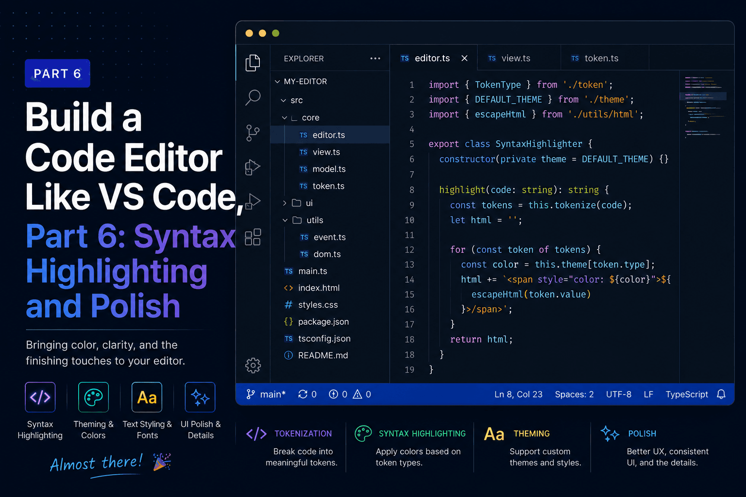
We've been making a promise since Part 1 that the editor would start without syntax highlighting. This is the part where we keep the second half of that promise and add it. We also add the comforts that separate a tech demo from something you'd actually reach for: a word-wrap toggle, draggable and collapsible panes, and the keyboard shortcuts to drive it all.
It rounds out the core build, so it ends by stepping back over what we put together across these six parts. From there, Part 7 is an optional add-on that levels those pieces up to look even closer to the real thing.
Here's the surprise: we don't need to install anything, add a parser, or run a language server. Monaco already ships with grammars for dozens of languages, and turning highlighting on for a file is a matter of telling Monaco which language that file is.
It helps to be precise about what we're enabling. There are two different things Monaco can do with a language. Tokenization reads the text and colors it, the keywords, strings, and comments you expect from syntax highlighting. That runs on the main thread from a built-in grammar, with no extra setup. Language services are the heavier features, autocomplete, error squiggles, go-to-definition, and those do need the per-language workers we deliberately skipped in Part 2.
We're adding the first kind. That's why this works with the single base worker we set up earlier, and why it's so little code.
A file's language is decided by its extension. Build a small lookup from extension to Monaco's language id.
src/renderer/src/editor/languages.ts:
const EXT_TO_LANG: Record<string, string> = {
  js: 'javascript', jsx: 'javascript', mjs: 'javascript', cjs: 'javascript',
  ts: 'typescript', tsx: 'typescript',
  json: 'json',
  css: 'css', scss: 'scss', less: 'less',
  html: 'html', htm: 'html',
  md: 'markdown', markdown: 'markdown',
  py: 'python', rb: 'ruby', go: 'go', rs: 'rust',
  java: 'java', c: 'c', h: 'c', cpp: 'cpp', cc: 'cpp', hpp: 'cpp',
  cs: 'csharp', php: 'php',
  sh: 'shell', bash: 'shell', zsh: 'shell',
  yml: 'yaml', yaml: 'yaml', xml: 'xml', sql: 'sql',
  swift: 'swift', kt: 'kotlin'
}

export function languageForPath(path: string): string {
  const ext = path.split('.').pop()?.toLowerCase() ?? ''
  return EXT_TO_LANG[ext] ?? 'plaintext'
}
Anything we don't recognize falls back to plaintext, which is exactly the behavior
we've had all along, so unknown files still open and edit fine, just without color.
Back in Part 2 we hardcoded defaultLanguage="plaintext" to keep highlighting off.
Now we replace that with a language prop computed from the file's path. While we're
in here, we also accept a wordWrap setting and flesh out the editor options to feel
more polished.
src/renderer/src/editor/EditorPane.tsx:
import Editor from '@monaco-editor/react'
import { languageForPath } from './languages'
import type { OpenFile } from '../App'

interface Props {
  file: OpenFile | null
  wordWrap: boolean
  onChange: (content: string) => void
}

export default function EditorPane({ file, wordWrap, onChange }: Props) {
  if (!file) {
    return <p className="placeholder">Open a file to start editing</p>
  }

  return (
    <Editor
      height="100%"
      theme="vs-dark"
      path={file.path}
      language={languageForPath(file.path)}
      value={file.content}
      onChange={(next) => onChange(next ?? '')}
      options={{
        fontSize: 13,
        fontFamily: 'ui-monospace, monospace',
        minimap: { enabled: true },
        scrollBeyondLastLine: false,
        automaticLayout: true,
        wordWrap: wordWrap ? 'on' : 'off',
        tabSize: 2,
        renderWhitespace: 'selection',
        smoothScrolling: true,
        cursorBlinking: 'smooth'
      }}
    />
  )
}
That single language prop is the whole feature. Open a .ts file and the keywords
go blue, strings go orange, comments go green. Because the language is keyed off
file.path, every tab gets the right grammar on its own, and a JSON file and a Python
file open side by side each look correct.
wordWrap is the first real user setting in the app, and it's worth doing it in a way
that scales. Rather than bury it inside the editor, we hold it in App as state and
pass it down. That's the seed of a settings system: every preference becomes a piece
of state at the top, threaded to the component that cares. Today it's one boolean. The
same shape holds font size, theme, tab width, and the rest whenever you want them.
We'll toggle word wrap with Alt+Z (Option+Z on a Mac), the same shortcut VS Code uses.
The handler checks e.code === 'KeyZ', the physical key, rather than e.key. On a Mac,
holding Option rewrites the character the key produces, so Option+Z arrives as 'Ω' and
a check against 'z' would never match. e.code names the key itself, so it's the same
on every platform and layout.
A draggable layout and a few keystrokes are what make the app feel native rather than like a demo. Two things we still owe ourselves: the panes should be draggable, which is the promise we made in Part 1 when we hardcoded their sizes, and the sidebar and terminal should hide and show on a keystroke.
Both come from one library. Allotment is the split-view component VS Code itself uses,
published as a standalone React package, so it's the same kind of choice we made with
Monaco and xterm: use the real thing. It gives us drag-to-resize, a minimum size per
pane, snap-to-collapse, and a visible prop that hides a pane without unmounting it.
That last detail matters for the terminal, because hiding it must not kill the shell.
npm install allotmentWe replace the Part 1 grid with two nested Allotment splits: an outer horizontal split
for the sidebar against everything else, and an inner vertical split for the editor
above the terminal. Each pane we want to collapse gets a visible prop wired to state,
a preferredSize for its default, and snap so dragging it small enough collapses
it. The editor pane is marked high priority, so when the window resizes the editor
absorbs the change instead of the sidebar or terminal.
The keyboard handler grows to cover everything: save (built in Part 5), close tab, toggle the two panes, and toggle word wrap. The tab and file logic from Part 5 is unchanged, so it's elided below for length.
src/renderer/src/App.tsx:
import { useEffect, useState } from 'react'
import { Allotment, LayoutPriority } from 'allotment'
import 'allotment/dist/style.css'
import './App.css'
import EditorPane from './editor/EditorPane'
import FileExplorer from './explorer/FileExplorer'
import TerminalPane from './terminal/TerminalPane'
import TabBar from './editor/TabBar'

export interface OpenFile {
  path: string
  name: string
  content: string
  savedContent: string
}

export default function App() {
  const [files, setFiles] = useState<OpenFile[]>([])
  const [activePath, setActivePath] = useState<string | null>(null)
  const [wordWrap, setWordWrap] = useState(false)
  const [sidebarVisible, setSidebarVisible] = useState(true)
  const [terminalVisible, setTerminalVisible] = useState(true)

  const activeFile = files.find((f) => f.path === activePath) ?? null

  // ...openFile, updateContent, saveFile, closeTab from Part 5...

  useEffect(() => {
    function onKey(e: KeyboardEvent): void {
      const mod = e.metaKey || e.ctrlKey
      if (mod && e.key === 's') {
        e.preventDefault()
        if (activePath) saveFile(activePath)
      } else if (mod && e.key === 'w') {
        e.preventDefault()
        if (activePath) closeTab(activePath)
      } else if (mod && e.key === 'b') {
        e.preventDefault()
        setSidebarVisible((v) => !v)
      } else if (e.ctrlKey && e.key === '`') {
        e.preventDefault()
        setTerminalVisible((v) => !v)
      } else if (e.altKey && e.code === 'KeyZ') {
        e.preventDefault()
        setWordWrap((v) => !v)
      }
    }
    window.addEventListener('keydown', onKey)
    return () => window.removeEventListener('keydown', onKey)
  }, [activePath, saveFile, closeTab])

  return (
    <div className="app">
      <Allotment proportionalLayout={false}>
        <Allotment.Pane minSize={150} preferredSize={240} snap visible={sidebarVisible}>
          <aside className="sidebar">
            <header className="pane-title">Explorer</header>
            <div className="sidebar-body">
              <FileExplorer onOpenFile={openFile} />
            </div>
          </aside>
        </Allotment.Pane>

        <Allotment.Pane priority={LayoutPriority.High}>
          <Allotment vertical proportionalLayout={false}>
            <Allotment.Pane priority={LayoutPriority.High}>
              <main className="editor">
                <TabBar
                  files={files}
                  activePath={activePath}
                  onSelect={setActivePath}
                  onClose={closeTab}
                />
                <div className="editor-body">
                  <EditorPane
                    file={activeFile}
                    wordWrap={wordWrap}
                    onChange={(content) => activePath && updateContent(activePath, content)}
                  />
                </div>
              </main>
            </Allotment.Pane>

            <Allotment.Pane minSize={80} preferredSize={200} snap visible={terminalVisible}>
              <section className="terminal">
                <header className="pane-title">Terminal</header>
                <div className="terminal-body">
                  <TerminalPane />
                </div>
              </section>
            </Allotment.Pane>
          </Allotment>
        </Allotment.Pane>
      </Allotment>
    </div>
  )
}
Hiding and showing is now just the visible prop. Toggling sidebarVisible or
terminalVisible animates the pane closed or open, and because Allotment keeps the
hidden pane mounted, the terminal's shell and scrollback survive the round trip. The
drag handles, called sashes, appear between the panes on their own.
The layout CSS gets simpler, because Allotment owns the sizing now. Replace the .app
grid rule and the pane rules from Part 1 with this:
.app {
  height: 100vh;
  background: var(--bg);
  color: var(--text);
  font-family: -apple-system, "Segoe UI", sans-serif;
  font-size: 13px;

  /* Allotment sash (drag handle) theming */
  --separator-border: var(--border);
  --focus-border: #0e639c;
}

.sidebar { background: var(--bg-elevated); }

.sidebar, .editor, .terminal {
  height: 100%;
  display: flex;
  flex-direction: column;
  min-height: 0;
  min-width: 0;
}
The --separator-border and --focus-border variables are Allotment's own theming
hooks; setting them makes the sashes match our dark borders instead of the library
default. The panes themselves just need height: 100% to fill the space Allotment
gives them. Don't forget to import Allotment's stylesheet, which the App.tsx above
does with import 'allotment/dist/style.css'; without it the sashes won't render.
Because the editor uses automaticLayout and the terminal a ResizeObserver, both
relayout the instant a drag or a toggle changes their size. The work we did in Parts 2
and 4 is what makes resizing feel immediate.
Run npm run dev. Open a few source files and watch them come to life with color.
Drag the sash between the sidebar and the editor, or between the editor and the
terminal, to resize them, and drag one all the way to its edge to snap it closed.
Press Alt+Z (Option+Z on a Mac) to wrap a long line, Cmd/Ctrl+B to hide the sidebar for more editing room,
and Ctrl+` to tuck the terminal away and bring it back with your session intact. Close
a tab with Cmd/Ctrl+W. It behaves the way your hands already expect, because we
borrowed the shortcuts from the editor everyone knows.
Over six parts we went from an empty folder to a working code editor:
The throughline is that almost every feature reused the same two ideas: privileged work lives in the main process behind a small typed bridge, and the renderer is just a React app talking to that bridge. Once those were in place, each feature was mostly deciding what to ask for.
This is a real editor, but a short list of additions would take it further, and each one slots into the structure we've built:
fs:search IPC handler that walks the open folder, with
a results panel in the sidebar.fs.watch in the main process and stream changes to the
renderer over the same one-way channel pattern the terminal uses, so the tree and
open files update when something changes on disk.Every one of these is a variation on what you've already done. That's the real payoff of getting the architecture right early. The hard decisions were made in Part 1, and everything since has been filling in the shape.
You've now built the core of a real editor from an empty folder. Part 7 picks it up from there, swapping the hand-rolled file tree for a production-grade one and adding a command palette, quick open, a status bar, and real autocomplete, so the editor edges closer to the one you use every day.