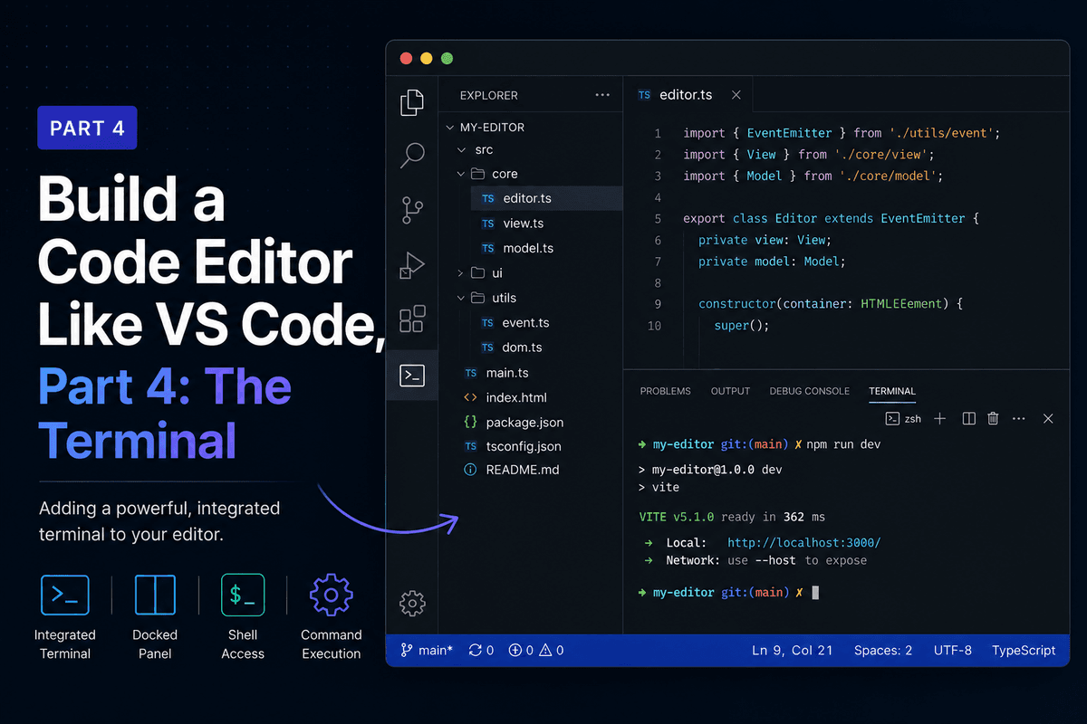
Build a Code Editor Like VS Code, Part 4: The Terminal
Build a Code Editor Like VS Code, Part 4: The Terminal The terminal is the part that makes this feel like a real editor instead of a fancy text box. In this...
June 25, 20267 min read
Thoughts on software engineering, web development, and lessons learned building products.
Build a Code Editor Like VS Code, Part 4: The Terminal The terminal is the part that makes this feel like a real editor instead of a fancy text box. In this...
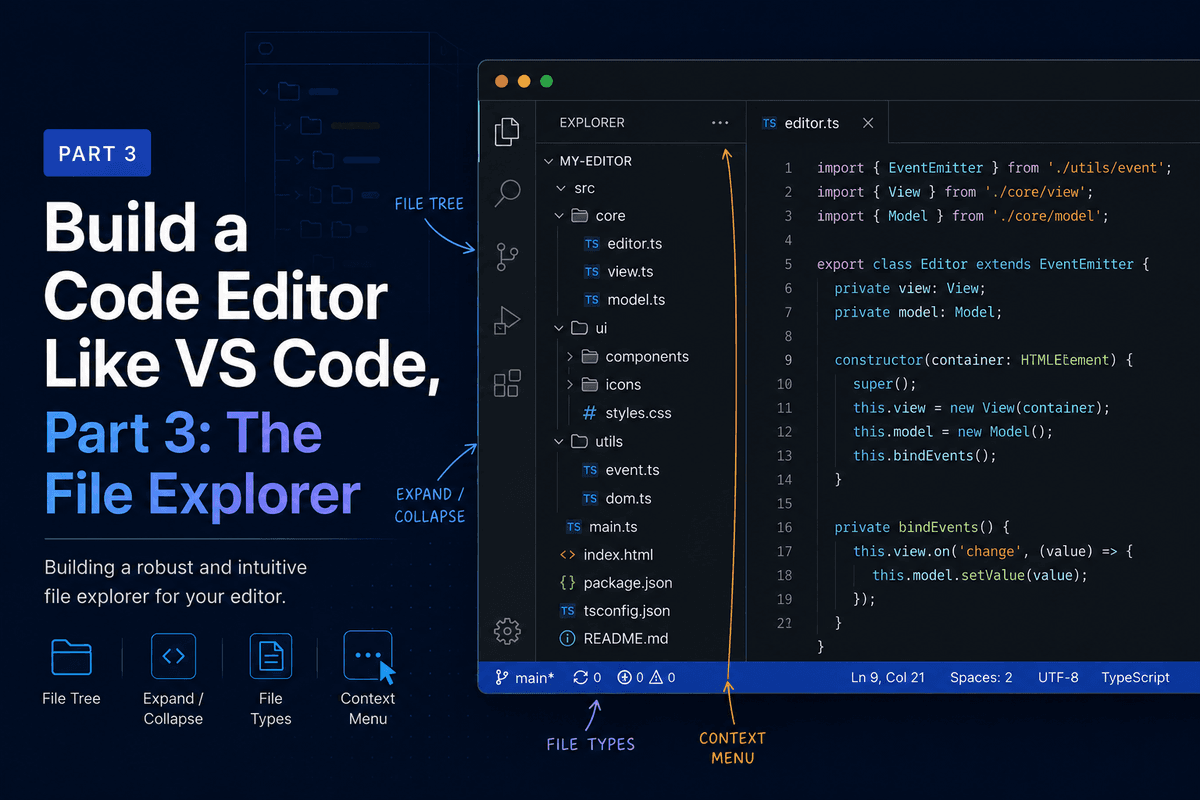
Build a Code Editor Like VS Code, Part 3: The File Explorer So far the editor shows hardcoded text. In this part we make it open real files. We build the file...
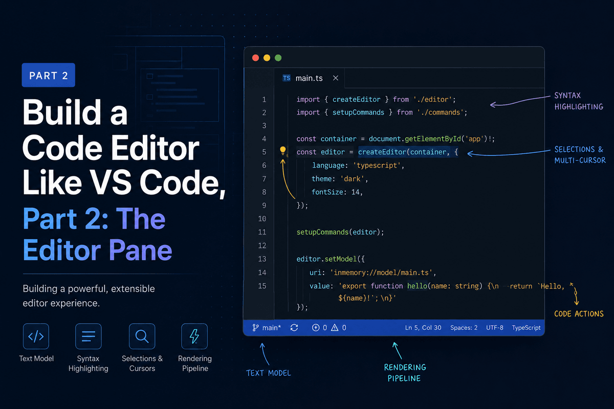
Build a Code Editor Like VS Code, Part 2: The Editor Pane In Part 1 we picked the stack and built a three-pane shell with placeholders where the real pieces...
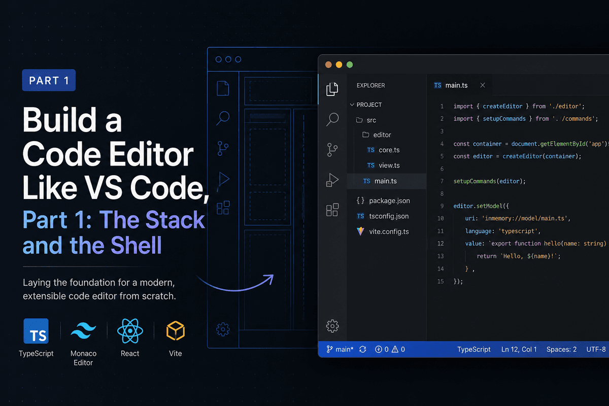
Build a Code Editor Like VS Code, Part 1: The Stack and the Shell This is the start of a series where we build a desktop code editor from scratch, the same...
Part 6: Polish, Persistence, and Publishing This is the final part. Over the last five posts, we built a working kanban board: data model, column layout, drag and drop, issue editing with markdown, and project/epic management with filtering. It works. But "works" is not the same as "finished." This post is about the difference. We will add dark mode with a manual toggle, keyboard shortcuts for power users, a project settings page with a danger zone, and then deploy the whole thing to Vercel. Along the way, we will add three final components to `@dxsolo/ui`: `Toggle`, `Kbd`, and `Tooltip`.
## Part 5: Projects, Epics, and Filtering Welcome back. In [Part 4](/blog/solo-kanban-part-4), we built the issue detail view — a modal with markdown editing, subtask management, and debounced auto-save. You can click a card, edit everything about it, and close the modal. Changes persist. But there is a problem. The board has one hardcoded project from the seed data. There is no way to create new projects, manage epics, or filter the board. The sidebar says "Epic filters coming in Part 5." Time to deliver. By the end of this post: - A project switcher lets you create and switch between projects - The sidebar lists epics with color dots, and clicking one filters the board - Epics can be created, edited, and deleted — with a color picker for the label color - A "+" button in each column header lets you create issues directly on the board - Two new components join `@dxsolo/ui`: `ColorPicker` and `AlertDialog`
Welcome back. In [Part 3](/blog/solo-kanban-part-3), we built a complete drag-and-drop system: cards move between columns, insert at precise positions, and persist to the database with optimistic updates. The board works. But clicking a card does nothing. Now we fix that. By the end of this post, clicking an issue card will open a modal showing the full issue — an editable title, a markdown description with live preview, a subtask checklist, and metadata controls for priority and status. Changes auto-save as you type. Along the way, we will add four new components to `@dxsolo/ui`: `Textarea`, `Select`, `Checkbox`, and `Badge`. This is the first time in the series we extend the component library. The goal is to show the workflow: identify a need in the app, build the component in the library, publish, and consume.
The browser ships a drag-and-drop API. You can set `draggable="true"` on elements, listen for `dragstart`, `dragover`, and `drop` events, and move things around. It works, but it has significant drawbacks for a kanban board: - **No built-in reordering.** You get drop events, but figuring out where in a list the user intended to drop requires manual hit detection. - **Poor mobile support.** Touch devices do not fire native drag events. You need a polyfill or a completely separate touch implementation. - **Accessibility is on you.** No keyboard support, no screen reader announcements, no ARIA attributes. You build all of that from scratch. For a production kanban board, this is too much work. We want a library.
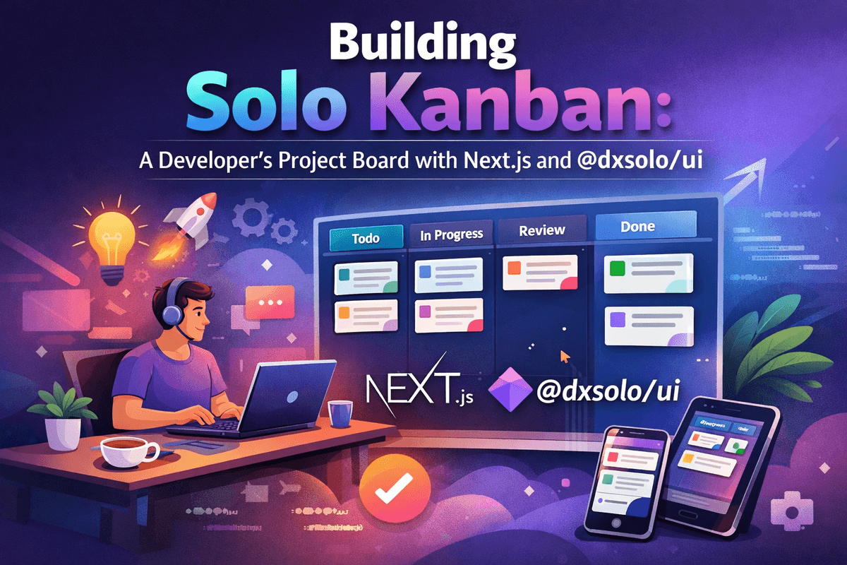
Welcome back. In Part 1, we scaffolded the project, designed the Prisma schema, seeded the database, and confirmed that @dxsolo/ui renders correctly. Now we build the thing people actually see: the kanban board. By the end of this post, you will have four scrollable columns (Open, InProgress, Review, Done), responsive issue cards powered by @dxsolo/ui, an app shell with a sidebar, and a layout that adapts from desktop down to tablet using CSS Grid and container queries.
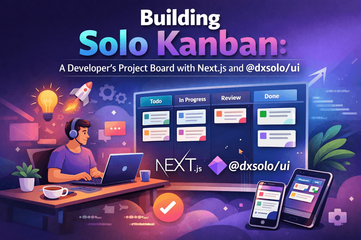
This is Part 1 of a 6-part series where we build a complete kanban board for solo developers. By the end, you will have a fully functional project management tool, a live demo, and a forkable GitHub repo. Along the way, we will contribute new components back to the `@dxsolo/ui` component library.